Design Document

Design Document
Game Overview:
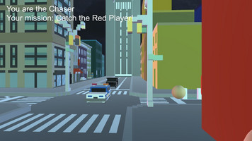
Dream Chaser, a game that lets players experience intense escaping-and-chasing in an incredible surreal dream world. At the familiar intersection of 5th Avenue and 13th Street in Manhattan, time stops for all objects -- except you and your "enemy"! Will you take part in the relentless slaughter, or will you stop and look up, stare at the upside down city overhead and try to find a way to wake up from this strange dream world?
World Design:
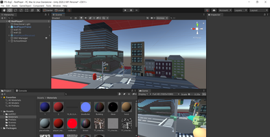
Using photos and data from Google Maps and field trips as reference, we reconstructed the intersection we pass every day to pixel-style 3D models, and implemented them in our game scene. This tall building with its dazzling blue lights is the landmark of our school, the University Center. Because the game is set in a dream world, the first tone we set for the world was, "familiar place with weird details everywhere." In addition, our team members are all from Parsons, and we all agreed that it would be interesting to turn the intersection in front of our school center into a game scene.
Environment Design:
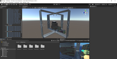
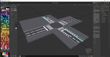
I started 3D modeling in a pixel-styled 3D model programmer called “MagicaVoxel”, which is really handy and easy to learn. The core and the frame of the environment is the crossroads. In order to make the players believe that they are really in a world where reversed gravity exists, I design the game world as a city with upside down buildings and roads. In my favorite part of the game design process, post processing, I added various filters and effects, such as bloom, grain, vignette and lens distortion, to make the game look no more “default”.
Coding:
After deciding which player is the Chaser in the current turn, the system will do a few things: first, give a point to the player who successfully catches the Escaper; Second, the identities of the two players will be exchanged. The original Trigger Collider of Chaser will be invalid and the next round of the game will be played as Escaper. Third, reset the countdown timer for a new round; Finally, each time a player scores, the distance between the two cities gets closer, making the game more difficult. Of course, these variables are interchangeable between the two online scenarios, and we describe the method used in the following local online section.
User Inerface:
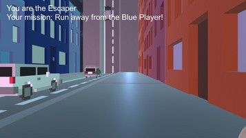
According to the player requirements we proposed, our user interface should include: player avatar, player's current turn identity and goal, countdown timer, whether the current gravity reverses, and when get caught. So we had a prototype user interface for this version. However, the color system was not uniform enough and the score hint was not big enough, so we chose the next iteration. In the final iteration of the user interface, we had a clear idea of what we wanted the player experience to be: red players and blue players each had their own color palette of UI components, and we wanted the player to feel confrontational; At the same time, we have enlarged the player's identity markers and made it very clear that every capture was successful.
Playtest:
We had several rounds of playtest among our classmates and professors. These are some of the feedbacks we received:
We should have more “game” feelings;
Add more sound design;
The map needs more places for players to hide and transit;
More storytelling could be added...
We will improve our game in the senior year ;) FOR REAL
Leave a comment
Log in with itch.io to leave a comment.